Increasing your ecommerce home page conversion rate can often be a complicated process.
Many times, improving your lift means drastically reducing home page clutter, simplifying the user journey, and completely overhauling your online store. But it’s important to recognize that multiplying click-throughs doesn’t always require a complicated strategy.
In fact, how you leverage the multimedia content on your website plays a critical role in driving click-throughs, subscriptions, and—ultimately—purchases. A simple tweak to your graphics, a better above-the-fold image, or a more engaging home page video may be the missing link between your current site and increased revenue.
Keep on reading to discover our tips for leveraging multimedia content for your eCommerce home page conversion rate.
Leverage Home Page Videos

When it comes to optimizing your online store, Moz recommends including a video on your home page—a piece of advice you’ll want to follow given the stats behind this strategy.
Unbounce reports that, in one study, video increased conversions by 80%, and Forbes, citing HubSpot, states that “64% of customers are more likely to buy a product online after watching a video about it.”
For your home page, here are a few video genres you’ll want to consider…
- Review video. If you have a number of products in a popular product category, consider producing a review video to help leads understand the benefits of each item and which one is right for them.
- Explainer video. Yum Yum Videos states that this genre features an animated video that “[explains] a business idea in a simple, engaging and compelling way.” If your products require background knowledge to appreciate their value, this is a great way to educate potential leads.
- Brand videos. These videos act as a commercial for your online store, touting what makes you different; a brand video is more of a brand statement than an in-depth explanatory video.
- Features video. Many ecommerce stores have products that derive their value from their unique features—not their price point. If your store falls into this category, you can use a features video to showcase distinctive features and help improve your ecommerce home page conversion rate.
- How-to video. How-to videos not only show potential customers how to use your products—they also provide a chance to help leads understand how your products will practically impact their lives…for the better.
- Testimonial video. Harnessing the power of narrative, a testimonial video allows potential shoppers to hear from one of your customers and what your online store can do for them.
Given the range video genres, you may wonder which to select as a strategy for increasing your ecommerce home page conversion rate.
Here are three quick tips to narrow your options…
- Clearly define your company’s message, culture, unique value proposition, and core values. These are what distinguish you from other online stores in the minds of your customers.
- List your customers’ pain points. In other words, describe what needs have driven them to search for your products or visit your website.
- Choose the video where your ecommerce store’s value intersects with customer pain points.
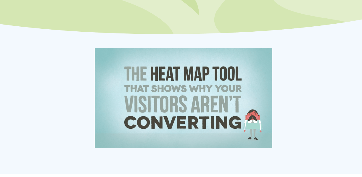
To see a great example of a video that does just that, check out Crazy Egg’s explainer video.

Notice how Crazy Egg uses an animated video to interweave customer pain points with its user friendly software for optimization issues. Crazy Egg explains away customer pain points with its own unique value proposition.
Important Tip: Perhaps you’re wondering whether to include an autoplay or standard video. Be sure to check out this article by Wistia to see why autoplay can create bandwidth issues and slow your customer’s page loading time.
Leverage Optimized Images

In addition to explainer videos, you’ll also want to harness the power of making the right image selections to transform visitors into customers.
VWO explains that, for one of its clients, changing a landing page image increased conversions by over 40%.
And, even though this article was written in 2013, it holds a lesson that’s still true today: theimages you choose for your home page have a significant impact on your ecommerce home page conversion rate.
However, to find the right image, you’ll need to do more than simply guess what pictures your customers will connect with. Instead of relying on hunches, be sure to…
- Research your ecommerce audience. From customer demographics to post-purchase surveys, you can’t underestimate the importance of researching your audience. Data from purchases, contact forms, and phone calls will give you the direction you need for selecting images. (For more on understanding your customers, check out this article we’ve written.)
- Use data from past campaigns. Even though fresh customer data is best, there’s no need to discount what you’ve learned about your audience from social media campaigns, email outreaches, or more. For instance, if certain pictures performed better for Facebook ads, incorporate this into your image selection.
- Test the images you select. The best research can’t compare to the hard evidence of A/B tests. After you’ve done your homework, be sure your run different home page image variations to see which ones increase your ecommerce home page conversion rate…or lower it.
Leverage Powerful Graphics

In addition to pictures and videos, graphics are another important part of your overarching multimedia strategy.
Because they stand out from the images and text on your home page, graphics can quickly grab your audience’s attention…and heighten their awareness of critical home page elements.
Here are a few ways you can use graphics to your advantage…
- Call visitors to action. Optimized call-to-action buttons and other graphics can funnel potential customers to the right product pages so you experience increased sales. If your home page uses numerous buttons, you’ll want to pay attention to Michael Aagaard who states he “consistently saw lifts by using My rather than Your in the button copy.’ In fact, he states one A/B test produced a 90% increase in the web page’s click-through rate (CTR) thanks to this small change.
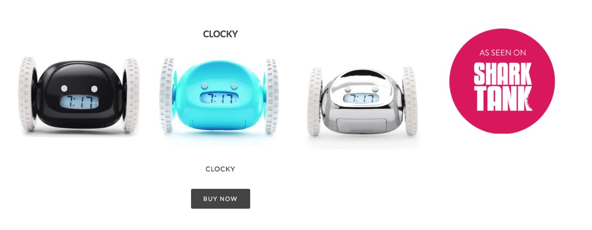
- Provide social proof. In addition to encouraging visitors to click, graphics also provide credibility for your home page. If your ecommerce store has served big-name clients or has ties to well-known organizations, be sure to include affiliated company logos and graphics that demonstrate to visitors the credibility of your online store. For instance, notice how Nanda Home touts its Shark Tank credentials in a home page graphic, tying its product to the credibility of a popular TV show.

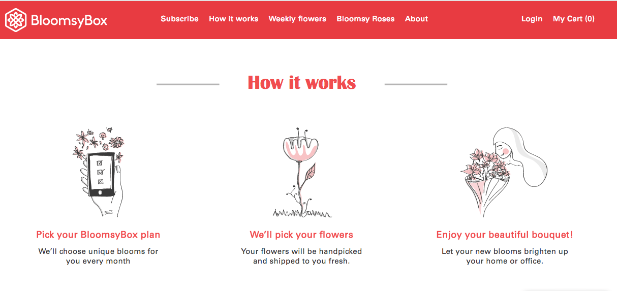
- Explain a process. Graphics also simplify information for your visitors, breaking up chunks of information and providing a visual complement to accompanying text. Here’s a great example from BloomsyBox. Notice how the company uses clever illustrations to catch viewers’ attention and explain the value they provide to their customers in an engaging way.

When you’re looking to improve your ecommerce home page conversion rate, optimizing your multimedia strategy is just one way to improve engagement, drive sales, and increase revenue for your business
For many websites, improving lift takes more than a multimedia makeover to remove the obstacles preventing visitors from becoming customers. If your online store experiences robust traffic, but struggles to generate revenue, it’s time to get to the bottom of your low click-through rate or sales.
When you partner with GroupFractal, you’ll connect with a team whose expertise goes beyond simply improving your Google ranking. Specializing in increasing sales for online stores, we empower you to capitalize on the resources you’ve poured into traffic.

